 Sign In
 0 Items (
 Search


Climategate – IPCC’s Flawed Temperature Picture Revealed
Since Copenhagen there have been revelations overseas of important flaws in the science used in reports by the IPCC. Believers in the dangerously rising temperature thesis have brushed these aside as “unfortunate” mistakes but as not affecting the alleged scientific consensus that continually rising temperatures result from the emissions of CO2 and usage of fossil fuels. Hence, it is argued, government action is still needed to prevent dangerous increases in temperatures in the future.
Now, however, we have a major new analysis by two Australian scientists showing that the temperature data published by the IPCC and other organisations has been manipulated to give the appearance of a warming trend – but not one that has actually occurred. In essence this analysis severely, probably fatally, damages the basis on which the IPCC and its supporters rely for their call for government intervention to reduce emissions. Needless to say, this has major international implications in regard to the policies to be adopted by countries on emissions reductions.
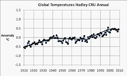
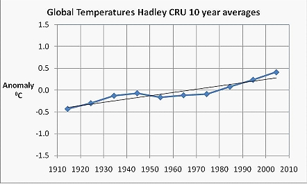
This analysis, undertaken by William Kininmonth (former Deputy Head of the Bureau of Meteorology and head of that body’s Climate Centre) – and physicist Dr Tom Quirk, shows that temperatures published for both Australia and the world by the IPCC, whose main source has been the Climate Research Unit at East Anglia University, derive from an averaging over ten years intervals. As shown below in graphed form, this method of presentation gives the appearance of a steady upward trend. However, the presentation of temperatures based on annual averages by Messrs Kininmonth and Quirk give no such appearance and highlight the irregularities. This analysis has been drawn to the attention of the Prime Minister and Leader of the Opposition and it has been suggested that it confirms the need for a major independent inquiry before any government action is taken to reduce emissions of CO2. One might add that it suggests the need for the two major parties to revise their existing global warming policies.
For the global data, the graphs showing the annual and ten year average temperatures presentations both give a similar picture up to the mid 1970s. It is important, however, to recognise that the increase in temperature between 1910 and the mid 1940s occurred at a time when CO2 concentrations in the atmosphere were increasing at a relatively slow rate whereas the flat period of temperatures from the mid 1940s to the mid 1970s occurred during the period of rapid post World War II growth in world economic activity and CO2 concentrations. The annual averages for the world also show a smaller increase than for Australia in the mid-late 1970s when the Great Pacific Climate Shift occurred, possibly because the effect of that shift would have taken some time to be reflected outside the Pacific region. The big difference between the ten year and annual presentations of the global data over the last ten years is that the ten year averaging process masks the return to relatively steady temperatures over the past decade.
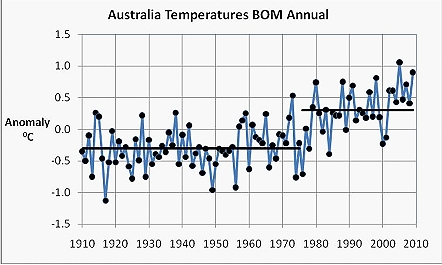
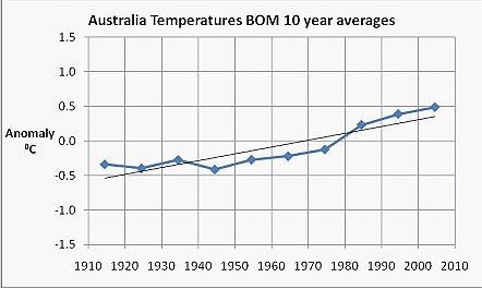
The graphs showing average temperatures for Australia bring out more clearly the differences between the annual and ten year averages presentations. While neither show a statistically significant upward trend between 1910 and the mid 1940s, the ten year averages then show a quite different picture. In particular, the annual averages for Australia shows the one-off jump of about 0.6C in the mid 1970s when the Great Pacific Climate Shift occurred due to a major change in the Pacific Ocean circulation that is accepted as having had nothing to do with CO2 emissions. In the ten year averages presentation, however, the averaging process makes this appear as little more than a component of an upward trend.
Assuming that the annual average data has not been manipulated (on which see further below), temperatures are admittedly now higher than they were a century ago. But that increase has not occurred in line with emissions of CO2 and a substantial proportion of the increase reflects a one-off event which had nothing to do with emissions. Moreover, it is now widely acknowledged (even by some believers) that there is strong evidence that temperatures were as high if not higher in the Medieval Warming Period (800 – 1,100) and the Greco-Roman warm period (600 BC – 200 AD). This means of course that there is no policy significance in the persistent claims made by the Government that we have the highest ever recorded temperatures. Hence, there is also little or no substance in the arguments that there is a cause and effect relationship between emissions and temperature increases justifying government intervention to restrict emissions and/or that the world faces a unique situation demanding Canute-like responses.
It might be added that the revelations about the flaws in IPCC science (sic) since Copenhagen make it extraordinary that the Government has announced that, regardless of what other countries do, it will adopt a 5 per cent reduction target for greenhouse gas emissions by 2020 as well as starting an emissions trading scheme in July 2012. These flaws included the totally unjustified claims about early (2035) meltings of Himalayan glaciers, which forced IPCC head Pachauri to apologise publicly for the error but left unexplained that an employee of his who had been responsible for the prediction remained as an employee. This was followed by the revelation that the IPCC has greatly exaggerated claims about likely increases in extreme weather as (if) temperatures rise and the warning by Britain’s Chief Scientist (endorsed by his Australian counterpart) that too great a degree of certainty is being attached to predictions (or is it the use of “projections” as, absurdly, attempts are made to pretend there are no predictions) and outcomes of modelling, as well as too little transparency being given regarding data use. On top of that submissions have been invited to an inquiry (Australians are eligible to submit) announced by the Science and Technology Committee of the UK Parliament into (inter alia) the adequacy of the terms of reference and scope of the independent review by East Anglia University of the CRU. It is little wonder that audiences for visiting lecturer and expert on the issue, Lord Monckton, are very high.
Of course, these flaws have produced a spate of responses from the “expert” scientists who are believers in the dangerous temperature thesis and who have been lead authors of IPCC reports. According to these experts, a couple of mistakes maketh not a wrong report. This of course is total nonsense given the many other earlier IPCC mistakes, such as the (now discredited) hockey stick analysis purporting to show that temperatures were lower pre-industrialisation. It also conveniently overlooks the fact that the hacked email exchanges between leading researchers and advisers to the IPCC (including the inventor of the hockey stick) suggest not only an exclusive “club” of scientists who “peer review” their own work or don’t even resort to peer review but one where all stops are pulled out to show a warming trend in temperatures over the past century or so.
As indicated, the graphs are constructed by using data compiled by the CRU. This data is obtained from meteorological authorities in various countries, including of course Australia’s Bureau of Meteorology. Preliminary examination by Messrs Kininmonth and Quirk of the “high quality” data published for Australia by the Bureau of Meteorology and used in its online climate trends suggests that further questions arise regarding manipulation to that data. In the case of Darwin, for example, where the CRU has made no adjustment to the original data, the BOM temperatures recorded between 1910 and 1940 were “adjusted” downwards by about 1.5 degrees, perhaps to take account of when the weather station was shifted from the Post Office to the airport. While some downwards adjustment appears to have been justified in order to obtain homogeneity, there is no basis for such a large adjustment, which was made in concert with an Australian lead author of the IPCC. The outcome is that a distinct warming trend is produced in the “high quality” data when no such trend would occur with a consistent adjustment . If Australia’s published data reflects unjustified manipulations by the BOM it is very likely that weather authorities overseas have also engaged in manipulations.
The foregoing suggests that the temperature data as analysed and presented by the IPCC and associated international research organisations do not provide a sound basis for the alarmist conclusions that have been reached and presented to governments. There is also a question about the validity of adjustments to Australia’s temperatures by our Bureau of Meteorology in compiling the so-called “high quality” data set. The temperature analyses, along with other similar alarmist claims, certainly justify a major independent inquiry before any government action is taken to reduce emissions of CO2. Such an inquiry would provide an opportunity for Rudd to change his extremist policy pending the inquiry’s outcome.
