 Sign In
 0 Items (
 Search


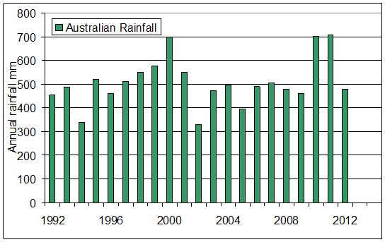
Only the Sydney Morning Herald and The Age, newspapers which have made themselves unquestioning altar boys in the temple of the global warming cult, could be expected to run an article fingering Australia for draining the oceans in 2010 by receiving excessive rainfall. The story was prompted by the US National Science Foundation, which issued a statement before the release of a report to be published in the Geophysical Research Letters journal.
According to Fairfax’s Carbon Economy Editor Peter Hannam — can a carbon-economy editor be taken seriously if there is no a carbon economy? — the experts have explained everything, at least to his satisfaction:
“New research from the US shows the normally dry outback regions of Australia acted like a gigantic sponge, sending sea levels sinking until the water gradually made its way back to the oceans via evaporation or seepage from land.”
This revelation was commented upon by David Karoly, one of the Climate Change Authority’s (motto: Non carbonis vestigium) most vocal high priests, who noted the high rainfall in 2010 and 2011. Professor Karoly is far more reliable, not to mention predictable, than Australia’s rainfall. Be it bushfires, high winds, unseasonable cold or searing heat, the Melbourne University academic is the go-to source for carbon-economy editors in need of a catastropharian quote or three.
So, should we take one of Australia’s most microphone-ready warmists at his word?
As can be seen below, Australia’s rainfall numbers do indeed suggest an inverse correlation with sea level in 2010 and 2011, but was there a direct connection?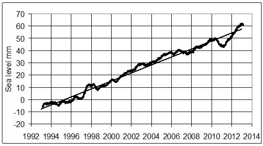
 An observant researcher might note a similar behaviour for global sea level in 1997-98, at the time of a very large El Nino event. However, when the sea level fell by some 6mm in 1998 we were the unlucky country, as we did not get the rain. Somewhere else must have received it. There is, perhaps, a simple explanation for the rise in sea level that can be seen by removing the annual rise of some 3 mm per year.
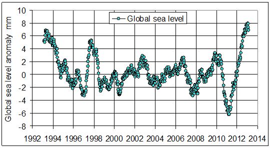
What you see in the chart above is a series of peaks in the sea-level anomaly, most particularly at the time of the Pacific El Ninos of 1997-98, 2003, 2007 and 2010. This could explain the sea-level rise and fall in the Pacific as the winds from the east moderated and warm surface water moved from the west of the Pacific to the east. This stops the upwelling of colder water in the Eastern Pacific. The ocean surface warms, the water expands a little and the sea levels rise. Heat transferred to the atmosphere is “teleported” to the other oceans, where after a little delay sea levels also rise.
When the wind in the Pacific returns to end the El Nino, the cold water returns. The sea surface then cools and the sea level falls globally.
So it seems to be how you draw the line and where you stand. Are you looking down into a valley, or are you looking up at a peak?
Whatever their vantage point, what climate-change gurus and carbon-economy editors should be looking at are the data!
Tom Quirk trained as a nuclear physicist at the University of Melbourne, where he took courses in meteorology. He has been a Fellow of three Oxford Colleges
